
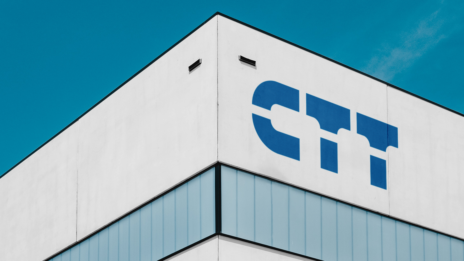
We redesigned the CTT brand, the initials of which stand for "Cooperativa Telefónica de Tostado." We optimized the design, removing unnecessary elements and adjusting the initials to reflect the new brand name.

We applied the golden ratio and a grid to perfectly adjust the design and proportions of the letters, improving usability and implementation in any situation.
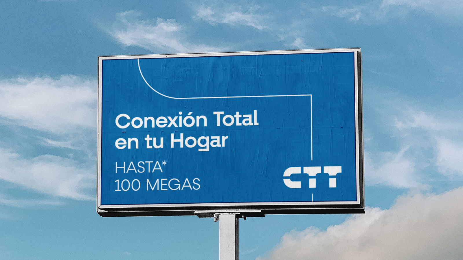
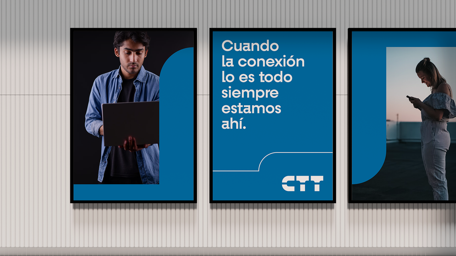
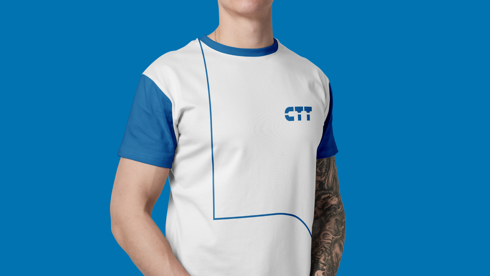
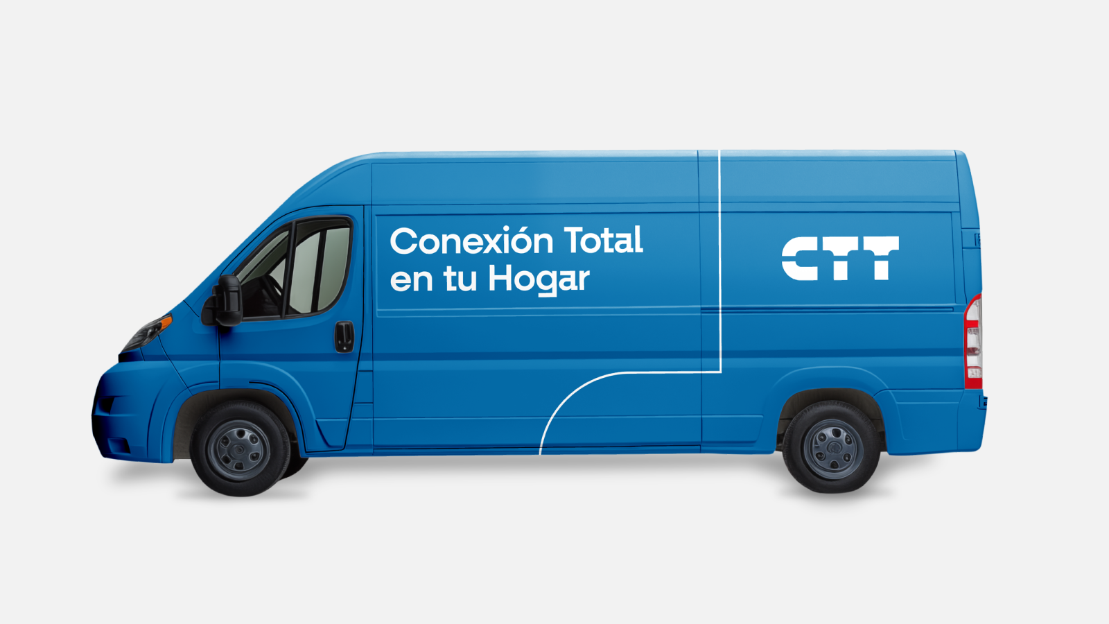
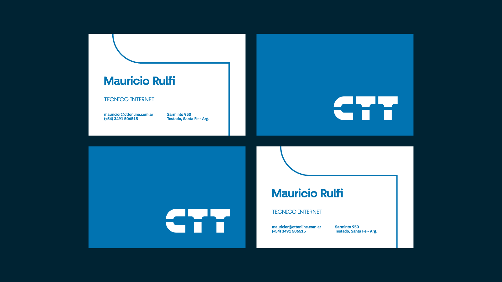
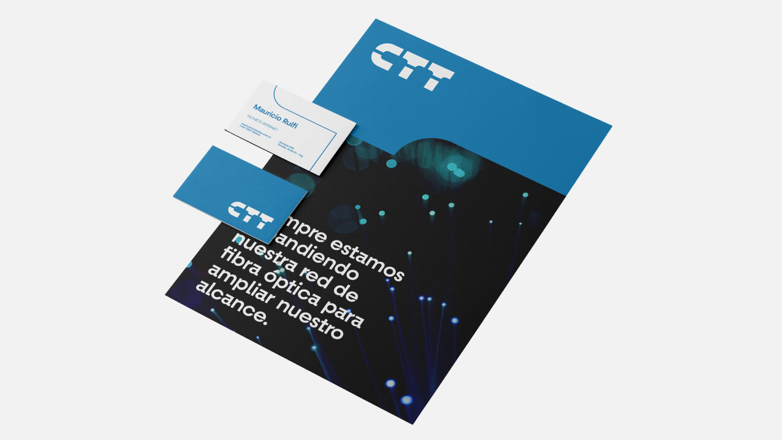
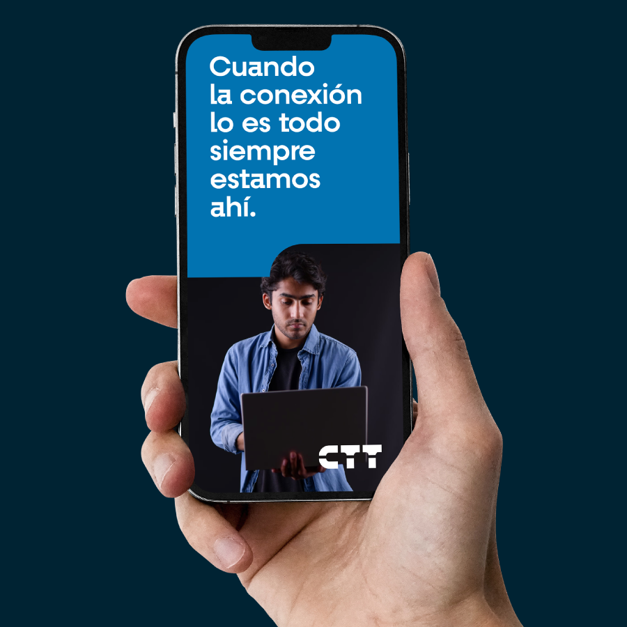
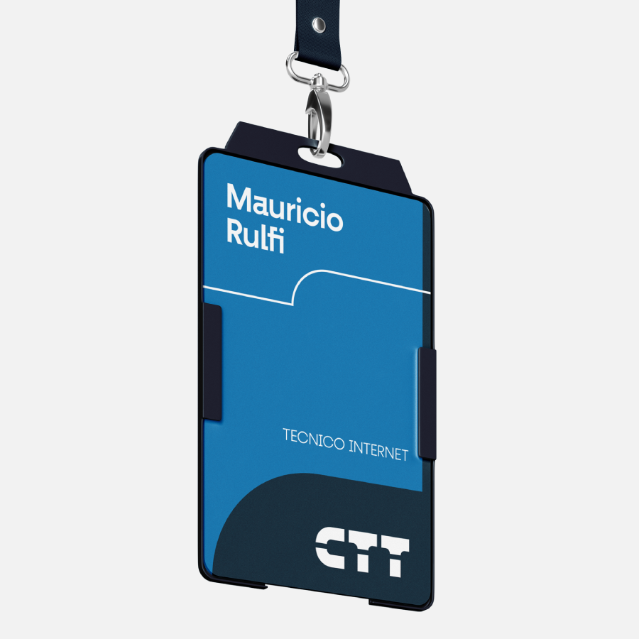
To generate a coherent brand image, we took the lines of the letters C and T, which will always be present in the brand's communication and dissemination.


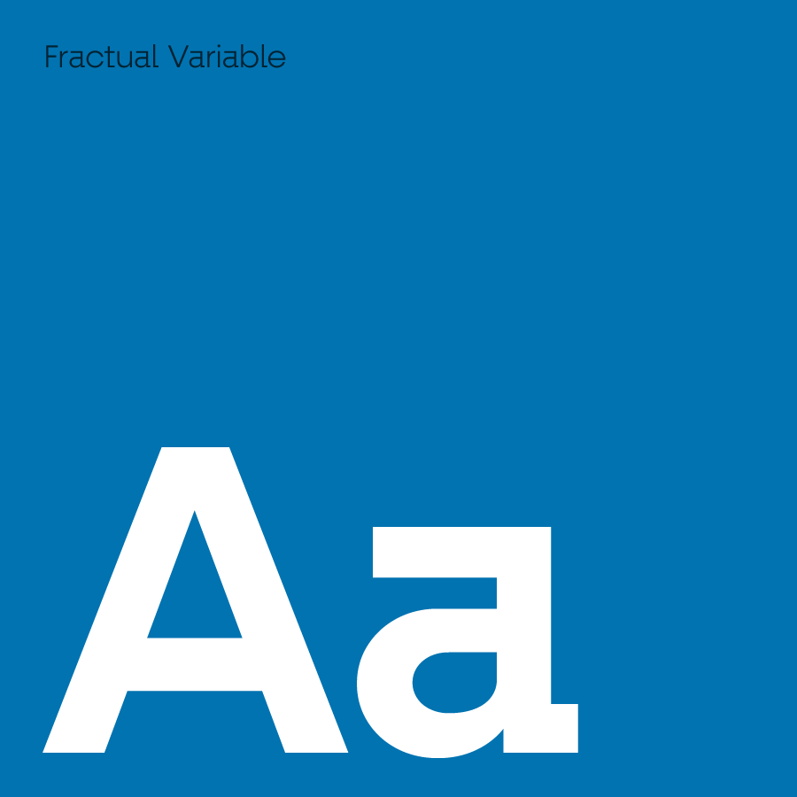
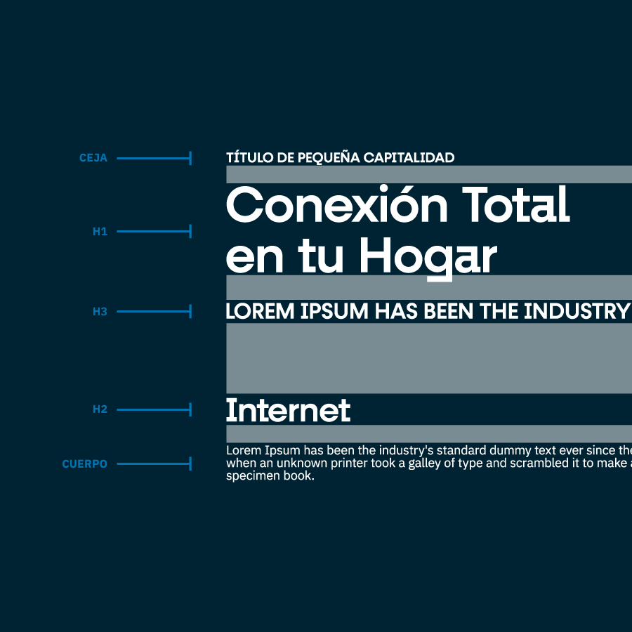
We used the Fractural Variable font for its modern design and because it shares morphological characteristics with the brand design.