
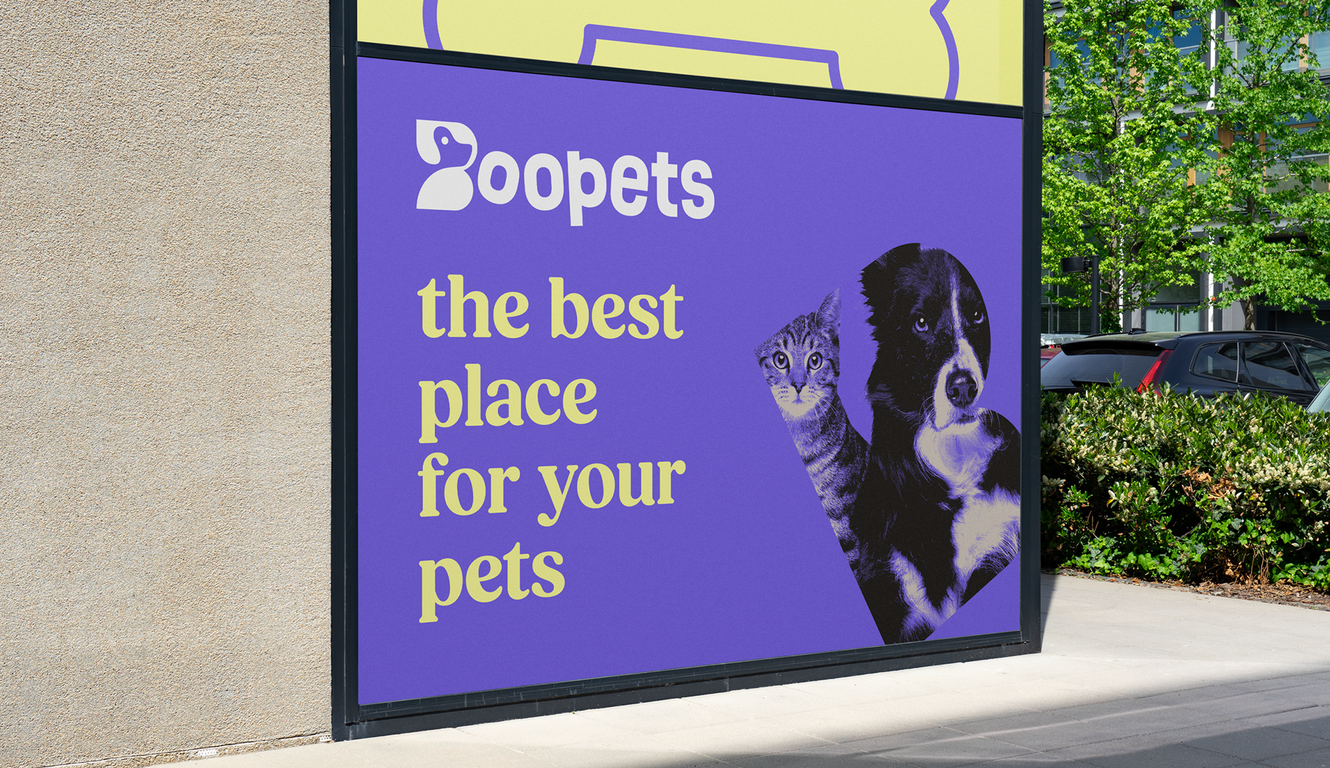
Boopets is a one-stop pet store based in the United States. It stands out for offering personalized pet services and products with a strong emphasis on dogs.

The arrangement and size of the letters give the logo a playful look, but the real intention was to give it movement, while maintaining good visual harmony and coherence.
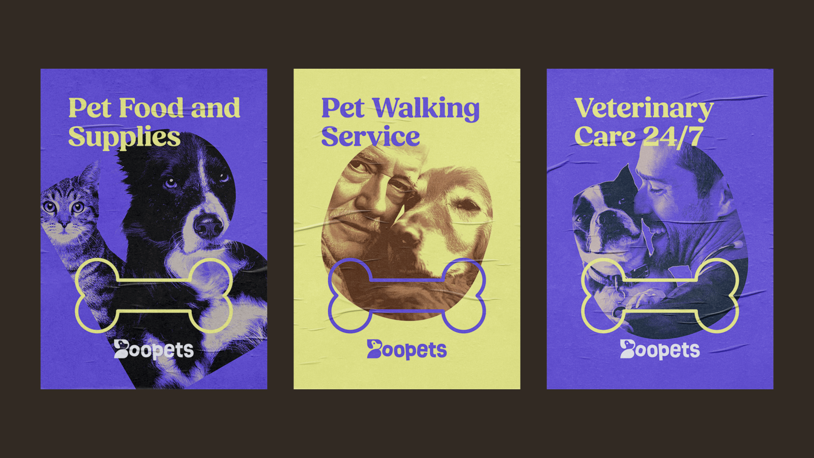
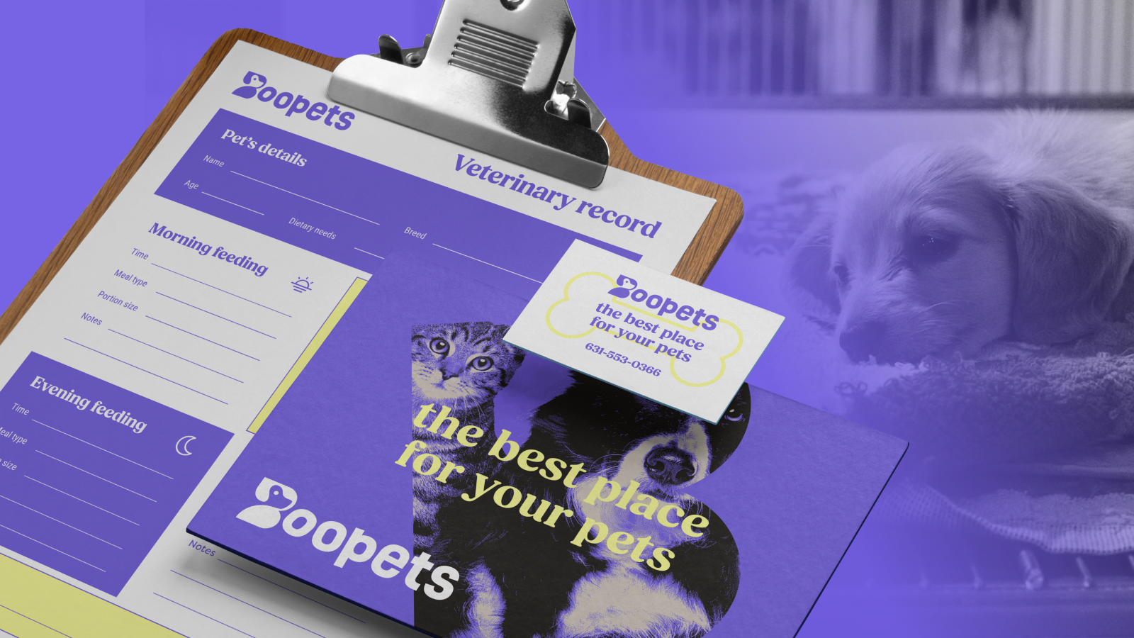
We used three elements to differentiate each service. And we used the first three letters of the logo, maintaining the brand's movement.
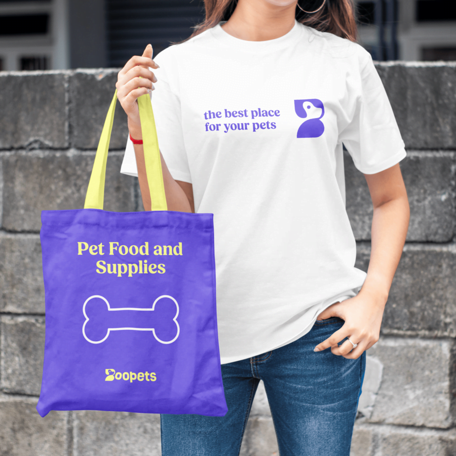
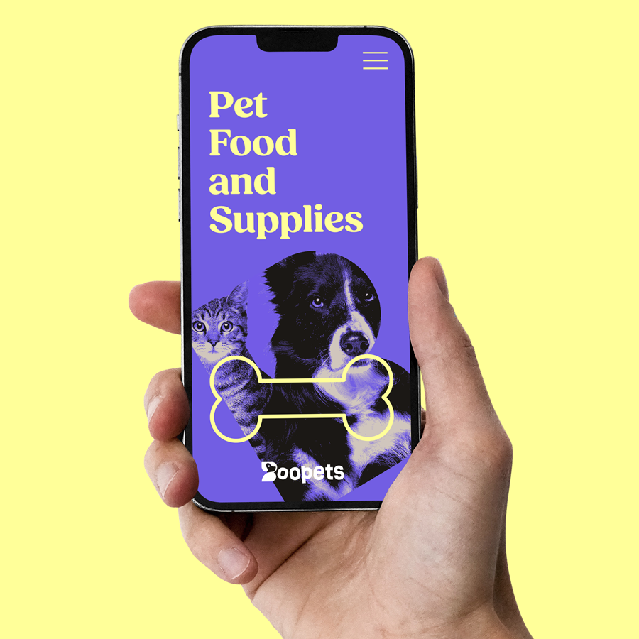
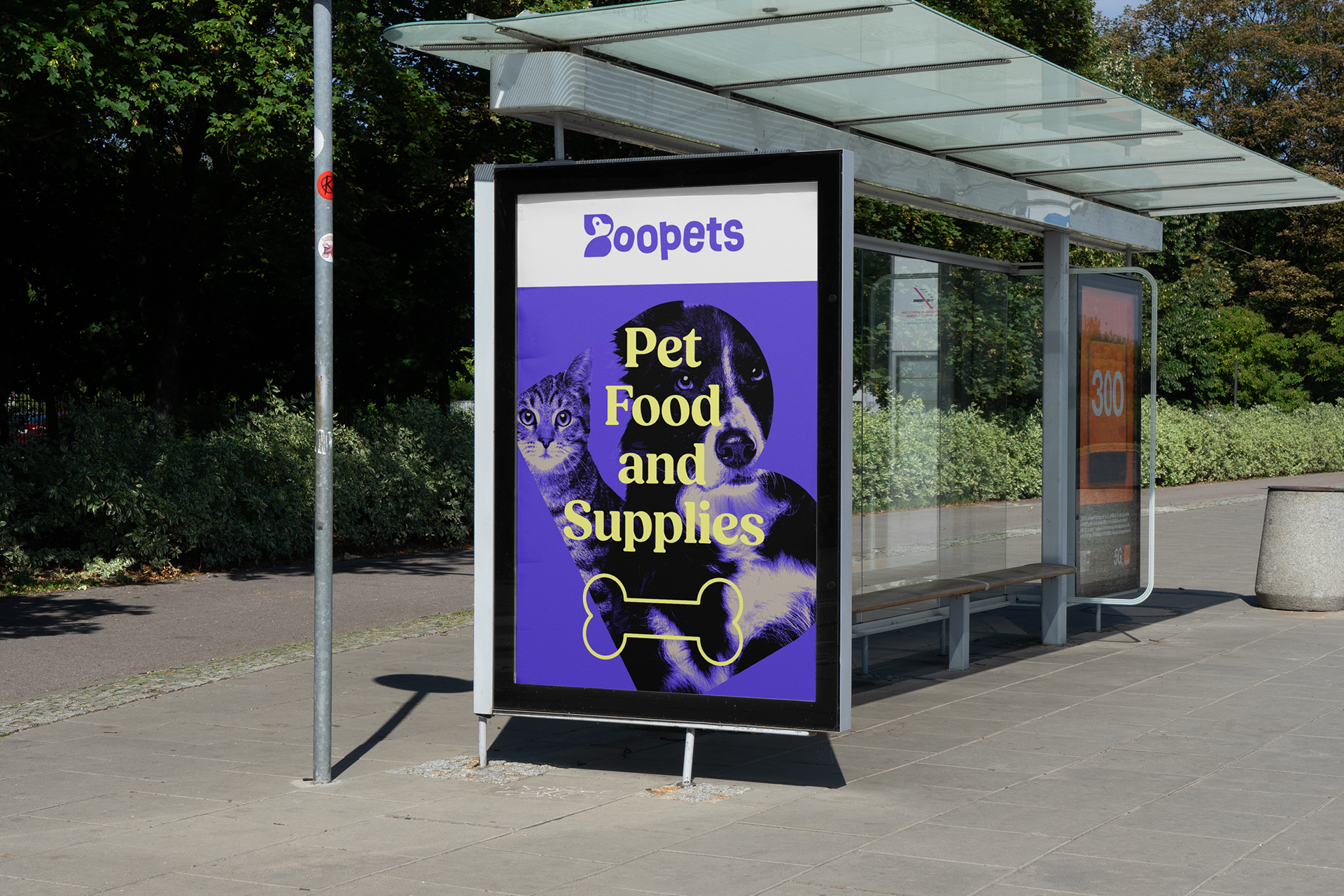
The letter B in Boopets appears in several implementations to achieve a stronger connection with the brand. The bone illustration is an accessory that not only helps reinforce the message but also provides further association in communication, when pet products are what needs to be highlighted.
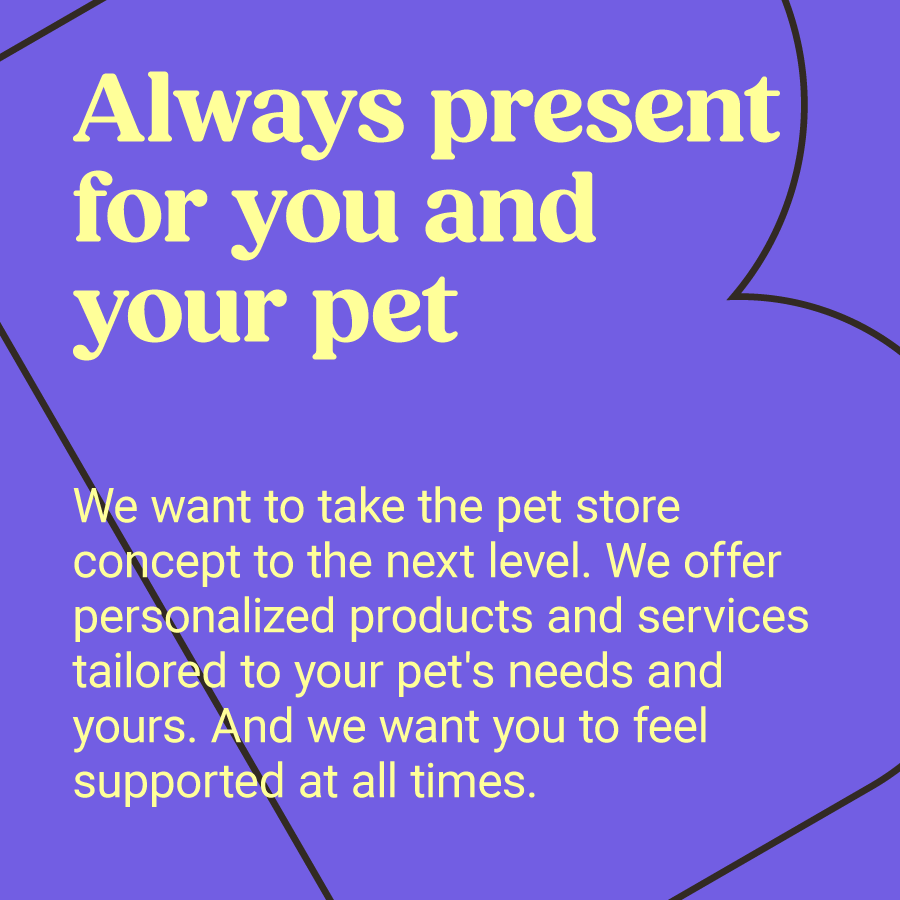
The brand's verbal identity is simple and direct, focusing on the store's advantages, along with its products and services.
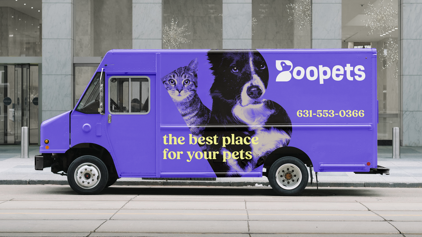
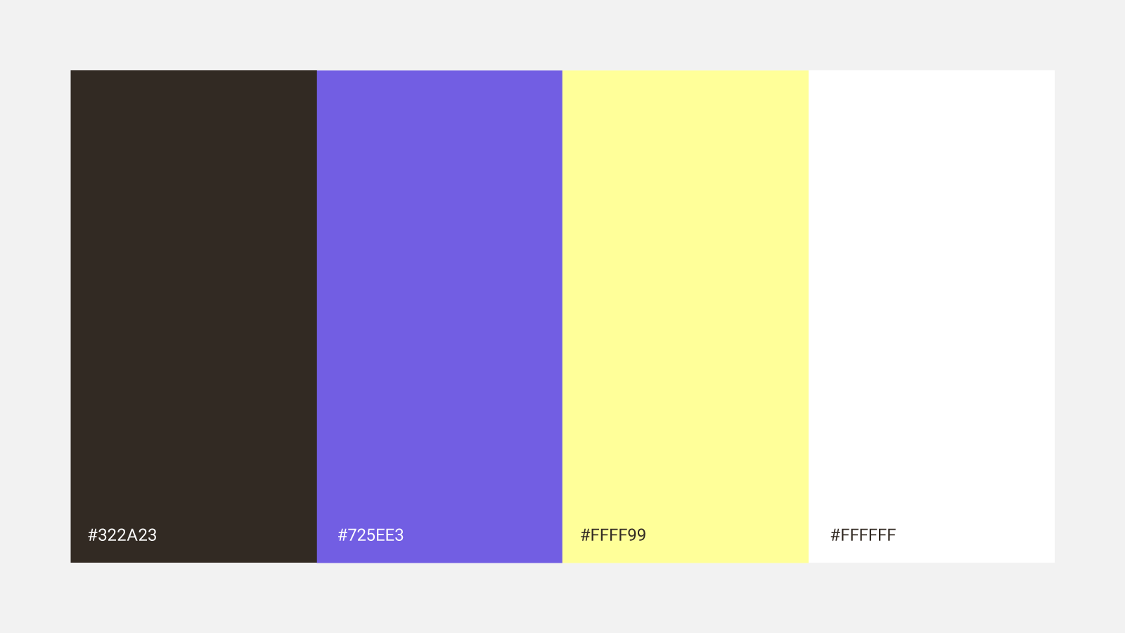
The color palette had to be striking, but not irritating to the eye. The violet-blue provides the necessary serenity to balance the yellow.
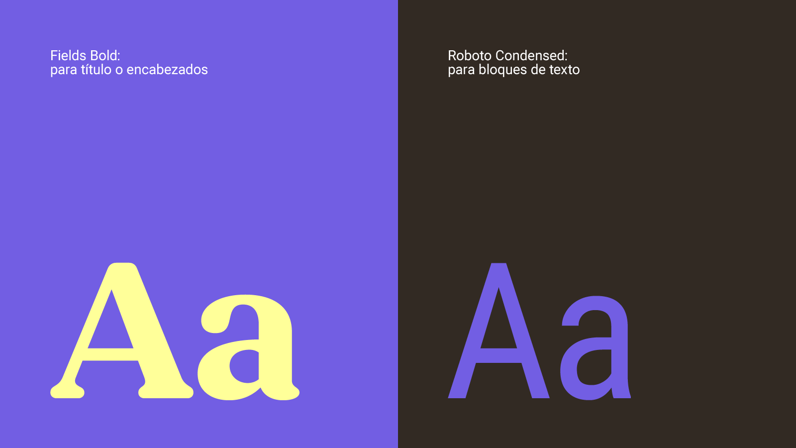
The Fields font has rounded details that are friendly and similar to the dog design found in the letter B of the logo. The Roboto Condenced font borrows some of the features from the font used in the logo.